tl;dr
Project: Portal for virtual operators (clone of housing co-op platform)
Role: Sole UIX designer
Problem: Legacy UI kit, inconsistent naming, no spacing/typography standards, hard-to-maintain front-end component library
Solution: Introduced the design tokens system, mapped to the component library
Impact: Reduced bugs, faster dev handoff, reusable system
Bonus: Later migrated the corporate design system to tokens
>
Background
I joined the third phase of a long-running modernisation for a major Danish provider. The goal was to adapt an existing housing co-op portal for virtual operators with new branding and features.
The dev team worked with MUI, while the design was based on an earlier version of the UI kit that was not originally intended for large-scale adaptation. It provided a solid foundation but required enhancements to support modern workflows, such as design tokens, semantic variables, consistent spacing, and auto-layouts for smoother collaboration and scalability.
>
The Problem
The UI kit lacked modern structure and semantic naming
Inconsistent typography, spacing, and color tokens
MUI implementation caused bugs due to manual overrides
Developers asked for mapped colors to reduce errors at least
>
My Initiative
Instead of addressing issues ad hoc, I proposed creating a design token system based on the existing UI kit to solve the problem more holistically and save time in future project phases.
>
What I Did
Spoke with developers to understand pain points and frequent issues
Reviewed MUI documentation to align tokens with their theme structure
Prioritised tokens: started with colors, typography, and spacing
Used Token Studio in Figma for token management
Synced tokens with Git to integrate into dev pipelines
Ran tests with core tokens — reduced front-end bugs and improved QA checks
Suggested using Style Dictionary for cross-platform readiness (web & mobile)
//
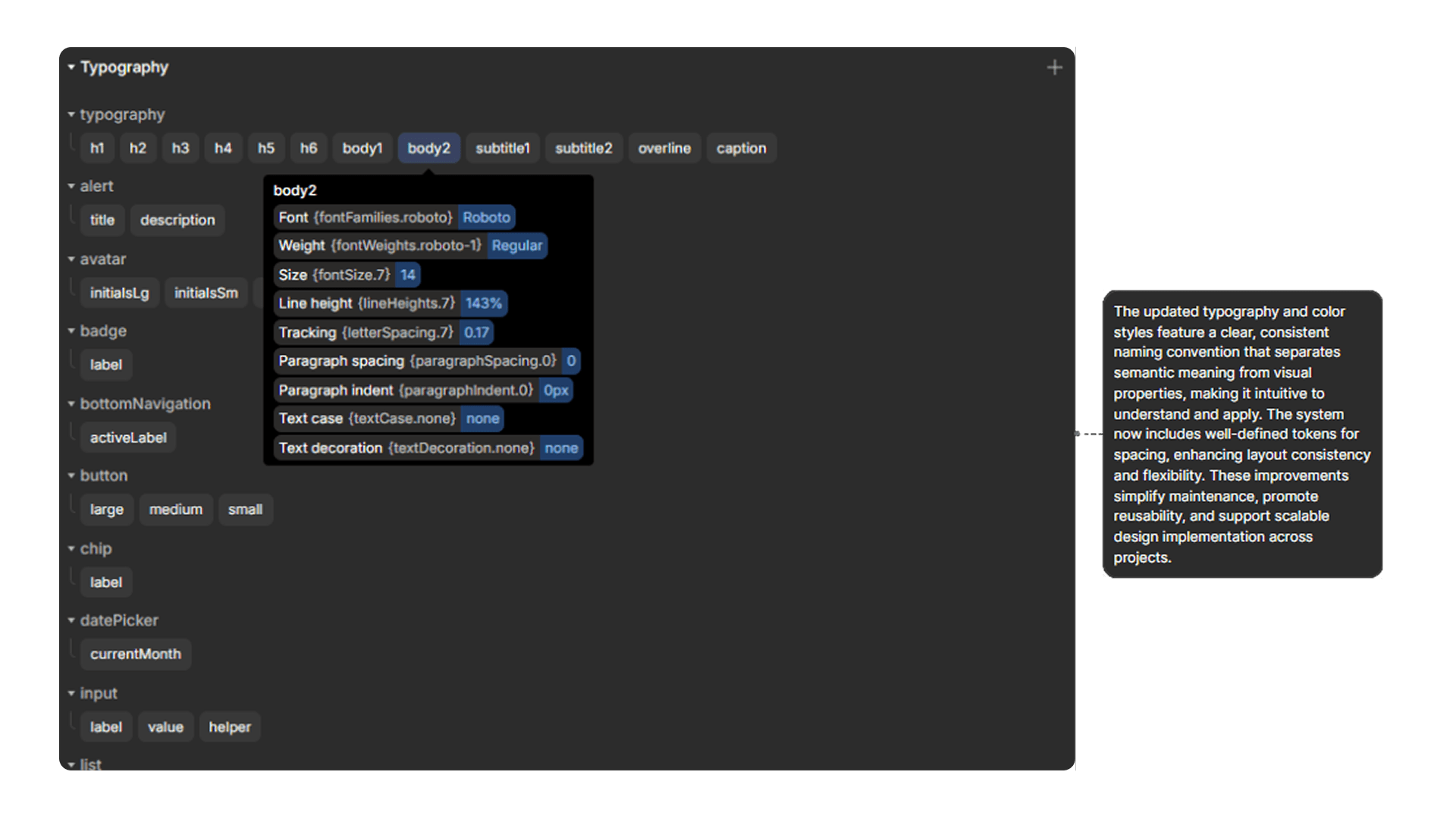
font tokens
//
color tokens

>
Outcome & Reflection
The token system improved communication between design and development, accelerated QA, and simplified support for future projects. Later, I migrated the entire corporate design system to a token-based system.
What could have been improved:
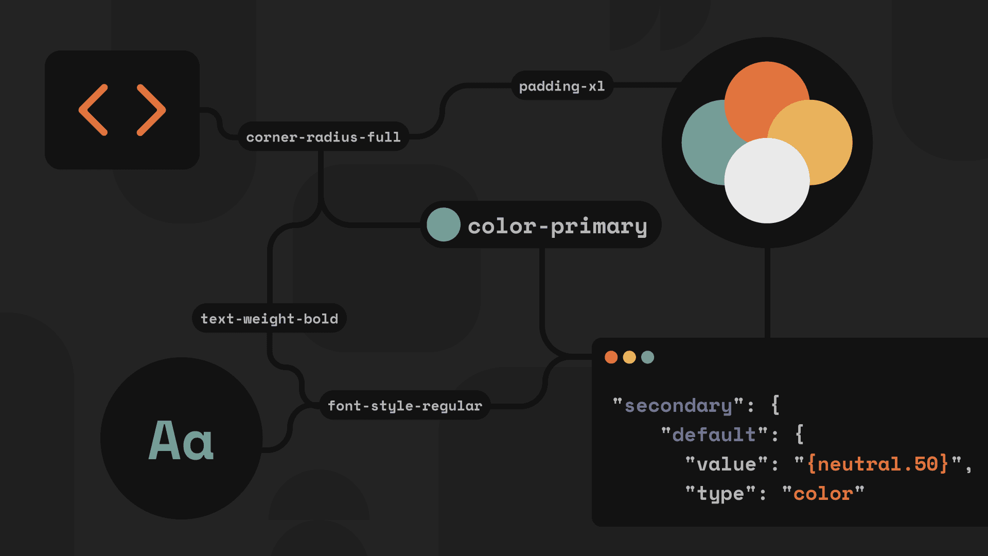
I realised that introducing a three-tier token structure from the start would have been beneficial:
Base level: raw values (e.g., #005BFF, 16px)
Semantic level: purpose-based naming (primary.bg, text.muted)
Component level: specific UI usage (button.primary, card.shadow)
//
example of three-tier sctructure approach implemented on project

This approach significantly improves scalability, maintainability, and brand adaptation across platforms. I implemented this structure in the following AI project, where it proved to be much more resilient and reusable.
Thanks for checking!
>
More projects